


Authors
.jpg)
Visualize Everything with AI
January 16, 2026
This article demonstrates how AI agents can be used to add visualizations and custom UIs to ML/AI projects in minutes, with a high degree of confidence in their correctness.
Last summer, Austin Parker at Honeycomb - a leading observability vendor - wrote a blog article titled “It’s The End Of Observability As We Know It (And I Feel Fine)”. The premise of the article is that AI fundamentally changes how we can add observability to real-world systems.
Historically, observability has relied on all-in-one tooling for calculating diverse metrics and building advanced dashboards, tasks that would have been tedious and error-prone to implement from scratch. AI fundamentally changes this dynamic: a single prompt can now implement a custom dashboard with domain-specific metrics and tailor-made visualizations, reducing the reliance on a generic, all-encompassing observability tool.
In the context of ML/AI systems, which often have highly specific observability requirements, this benefit is substantial: Instead of relying on generic model metrics, agent traces, or data quality monitors, you can laser-focus on custom metrics and visualizations tailored to your use case, data characteristics, and business indicators.
Quoting Austin, “This is a seismic shift in how we should conceptualize observability tooling. If your product’s value proposition is nice graphs and easy instrumentation, you are le cooked”.
Observability is the Goldilocks case for AI codegen
A common concern is whether a dashboard generated by Claude, Cursor, or another AI agent can be trusted. When an agent is tasked with building an entire system from scratch without any scaffolding, observability included, it is hard to build confidence in the end-to-end correctness of the whole stack.
A better approach is to build your production systems with a higher degree of validation and human attention, and treat observability as an independent concern. Similar to how a traditional observability tool, such as Datadog, sits alongside your production systems without affecting their behavior, this separation allows you to ring-fence any concerns about correctness just to the observability dashboard, knowing that its input data, code, and models are properly validated.
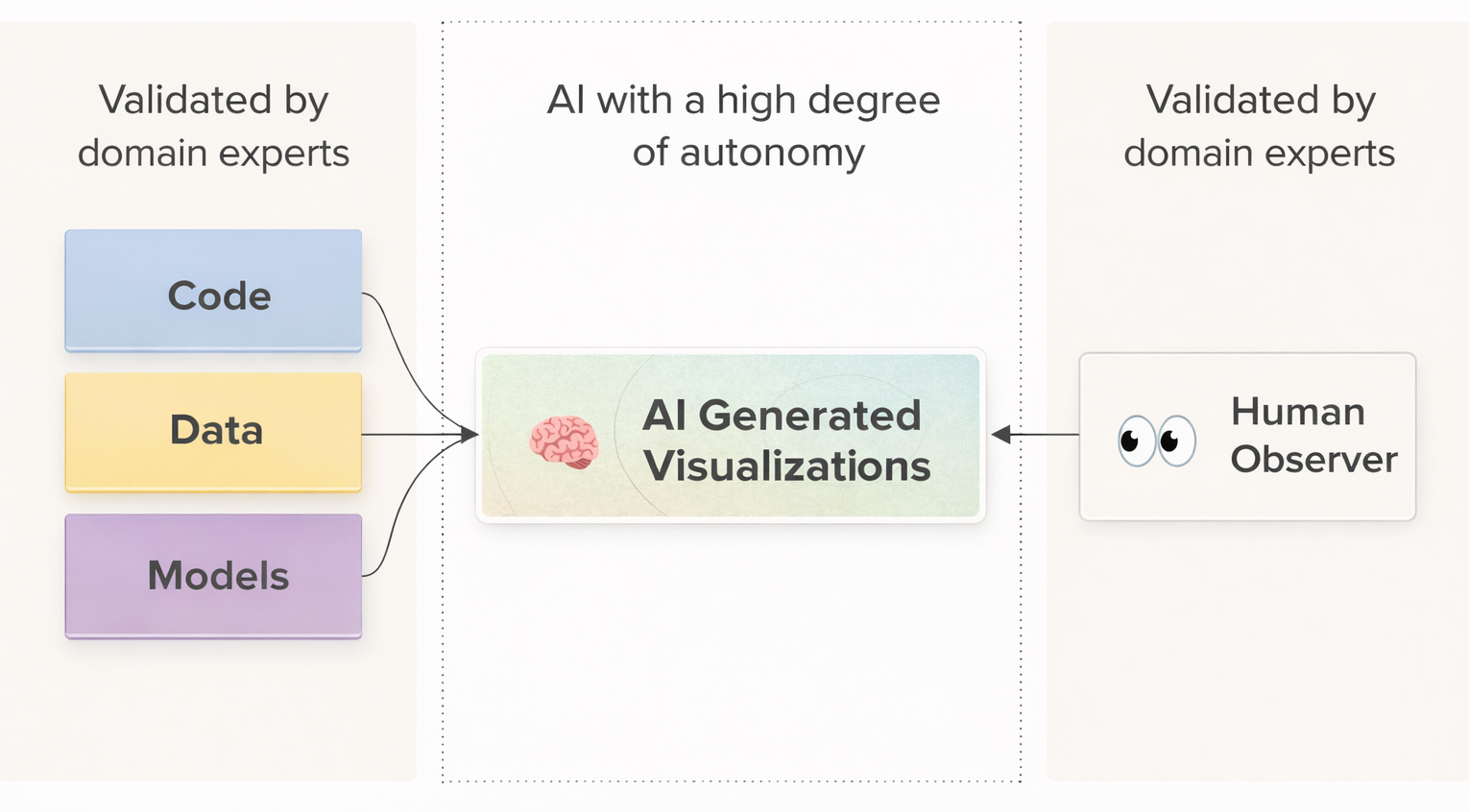
As illustrated above, AI-generated dashboards sit comfortably between two trusted layers: upstream production systems that supply verified data, and downstream human observers who can rapidly assess plausibility at a glance. Most visualization errors, such as incorrect aggregations, misaligned axes, missing series, or implausible trendlines, are visually obvious and can be corrected with a prompt or two.
As a result, dashboard generation is a particularly good fit for autonomous AI with a low cost of validation. This is amplified by the fact that AI excels at generating UI code, thanks to a large corpus of high-quality public examples.
Example: AI-generated charts in Metaflow Cards
Let’s take a look at how the idea works in practice. The examples below were generated with Claude Code using Opus 4.5. You will likely get similar results using any state-of-the-art AI code generator.
You can reproduce the examples with open-source Metaflow locally. If you don’t have an existing Metaflow or Outerbounds deployment, you can use either the dev stack or the local card viewer to follow along.
This Metaflow repository (structured as an easily deployable Outerbounds project, if you are already on the platform) includes a dataset covering wildfires in California and trains a model predicting the risk of damage to a building with specific attributes. If you are curious, you can take a look at the instructions in CLAUDE.md that suggests an effective workflow for creating cards.
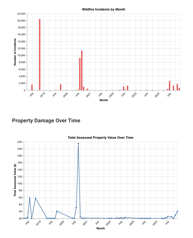
We start with simple but practical Metaflow cards that leverage default card components. To try this at home, go to the experiment directory, which contains a few basic examples to guide the agent, and execute the following prompt:
Read instructions in CLAUDE.md. See a flow at flow.py
that loads a wildfire dataset. Create a card that shows
the number of wildfire incidents by month, as well as a
separate chart showing the total damage value over time.
The result is a cleanly encapsulated, brief Python module that produces exactly the charts requested:
Next, we can up the game by visualizing the model and the features used by WildfireFlow. A typical need for a model of this nature is to visualize feature importances, which we test with the following prompt:
Read CLAUDE.md for instructions. Add a card to flow.py,
in the train step, visualizing feature importances. In
the feature importance card, also highlight what feature
values are strongly correlated with destruction.
The one-shotted result is a clean and readable module with 100 lines of visualization code, producing charts that match the prompt impeccably (with thematic colors):

Example: An AI-generated custom card
Charts like the above would take a few hours to produce manually, but the task is well within the capabilities of a data scientist or an ML/AI developer. The effort increases dramatically when visualizations move beyond basic charts.
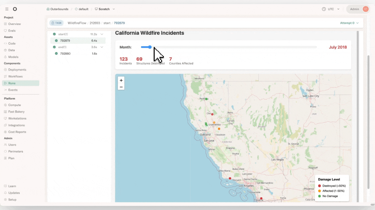
Because the wildfire dataset is both geospatial and temporal, a map is the natural way to visualize it. To support time-based exploration, we ask for a card that provides a map with a date selection slider:
Read instructions in CLAUDE.md. See a flow at flow.py
that loads a wildfire dataset. Create a card that shows
a slider (month by month) and a map showing all
incidents for the selected month.
Note that the prompt doesn’t suggest how to implement the card, but the agent realizes - probably based on the guidance in our CLAUDE.md - that a custom HTML implementation is appropriate.
Although the capabilities of AI code generation shouldn’t surprise anyone in 2026, it is magical to see a single prompt producing perfect results:
Again, the code is beautifully encapsulated in a highly readable visualization module.
Metaflow Cards ❤️ AI
Consider Metaflow cards as a visual, real-time, and often interactive interface to a task and assets produced by it. Importantly, cards are stored and versioned together with the task, so you can easily share and audit results.
As shown by the above examples, cards provide a perfect medium for AI-generated, production-grade observability:
- They provide a simple and clean API, including the default card components, which agents can follow easily.
- They are readily amenable to quick local testing and visual inspection, so agents can correct their mistakes autonomously.
- They are automatically packaged with production deployments and readily exposed through the UI, while being safely isolated from other business logic, so the agent doesn’t have to worry about infrastructure or meddle with sensitive security policies.
- They are infinitely versatile, allowing agents to generate any self-contained HTML files, which is perfectly within the capabilities of AI agents today.
They are versioned by default, making it straightforward to keep iterating on observability, utilizing branches and namespaces for testing and validation.
Purpose-built UIs for the win
While cards address many important aspects of observability, they are intentionally not designed to cover every use case. In particular, cards are not coupled to a backend service, so they can perform only a limited amount of computation on the fly. If you need real-time processing, for instance, to slice large datasets or running model inference, you will need a separate service.
Building a standalone visualization tool is well within today’s AI capabilities, using frameworks such as Streamlit or a FastAPI backend with a dose of custom TypeScript. Crucially, we are not asking the AI to perform business-critical operations such as building models or processing data. Instead, we access results produced by verified production workflows via the Metaflow Client API. This constrains the scope of AI code generation to the UI layer.
At Outerbounds, we actively encourage customers to build custom, domain-specific UIs for their use cases. Even simple, purpose-built interfaces that answer the exact questions at hand are far more effective than the most capable general-purpose dashboard or dashboard builder. Accordingly, such UIs can be included and securely deployed as first-class components of projects on the platform.
Example: An AI-generated app
To test the feasibility of the idea, let’s generate a standalone Streamlit application that retrieves the model trained by WildfireFlow and allows you to evaluate wildfire risk scenarios for buildings of different types.
We prompt Claude as follows:
Create a Streamlit app that uses the Metaflow Client
API to fetch the destruction-prediction model from the
latest successful run of WildfireFlow. The app is a
scenario-builder that allows the user to choose feature
values (including a county by clicking a map) which it
then inputs to the model to provide an estimate for the
likelihood of destruction.
We can test the resulting Streamlit application locally. Because Metaflow artifacts are immutable, this can be done safely using production data, without risk that Claude might inadvertently modify production databases or models. Thanks to project branches that scope artifact access automatically, we can easily vibe code and deploy variants of the app as the model evolves.
The one-shotted result is almost perfect, just requiring a tiny bit of refinement:
Clicking "Predict Destruction Likelihood" button in
the Streamlit app doesn't show any output. It should
show the destruction probability clearly.
After these two prompts, the application works as intended. A few years ago, a data scientist might have spent ten minutes visualizing a single facet of the data in a throwaway notebook. In 2026, the same amount of time (and less expertise) can produce a full-fledged, interactive application.
This short video walks through the resulting project, from executing the flow and viewing its cards to using the generated application:
Start visualizing everything
It is astonishing how easy it has become to elevate observability for any system. With the right scaffolding, creating custom reports and dashboards is now effectively free. With a framework like Metaflow, projects can be structured so that vibe-coded visualizations are highly likely to be correct and safely isolated from production, ensuring zero interference.
If you have any questions about the example featured in this post or you need help getting started in general, join the friendly Metaflow Community Slack.
If you are looking for a secure, managed environment to build production AI/ML systems with next level observability — including custom UIs — you can get started with Outerbounds today.

Start building today
Join our office hours for a live demo! Whether you're curious about Outerbounds or have specific questions - nothing is off limits.
We can't wait to meet you soon! Keep an eye out for a confirmation email with the deets.


